Where is the good art?
It’s late 2017, and I’m shopping at a wildly popular, contemporary home decor store (that everyone adores) and I’m in the kitchen towel and placemat section. It suddenly occurs to me that I’m looking at some moderately expensive cotton towels with extremely crappy art printed on them. Some towels feature sad tomatoes and frumpy lettuce. Others feature lemons that look like an artist hastily painted them in about 5 minutes—was that on purpose? These towels look like no one cared what was printed onto them—not even the managers of this fancy store I’m standing in. What is happening here? Has it always been this way at this store? Or has this brand just realized that they don’t need to invest in good design or artwork anymore due to their popularity? Can’t they tell these kitchen towels are not worth owning? I admit, it’s not all the brand’s fault. There are customers buying these sad pieces of cotton. They are buying them because this is what is available. Sadly, an absence of good design and artwork in home décor has become normalized over the last 25 years. Whatever the reasons, these crappy, sad-looking towels are on display in this “world-class” store and I find it depressing.

Craftsmanship of the 18th century
100+ years ago, mass production and rushing things to market wasn’t central to the retail experience. People purchased goods with their hard-earned money because they were made well and featured excellent artwork—very fine art that took time to make. There were etchings, ink drawings, and paintings. All reproduced from original artwork that was made by hand, oftentimes in ink, and not on a computer. I know this because I studied art in college and majored in drawing and graphic design. I’ve personally been illustrating children’s books and creating drawings for band merchandise since 2006. But seeing those towels was the first time that it occurred to me: we all deserve better and we need to get back to those times when artwork and surface design was higher quality. Yes, you can find great wallpaper today. Yep, you can probably find a lovely comforter with a nice pattern on it. You can even find a gorgeous blouse donning adorable owls or sparrows. But what happened to home décor? I love decorating and I love my kitchen, my living room, my master bath. I want to put lovely things there that make me smile and that are of the highest quality and design. So, I set out to start illustrating for myself, with home décor in the back of my head. In my mind’s eye I could see new drawings of vintage-inspired botanicals and forest animals that were joyful, striking, colorful. But perhaps most importantly, pristinely drawn.

Tackling a very classic theme
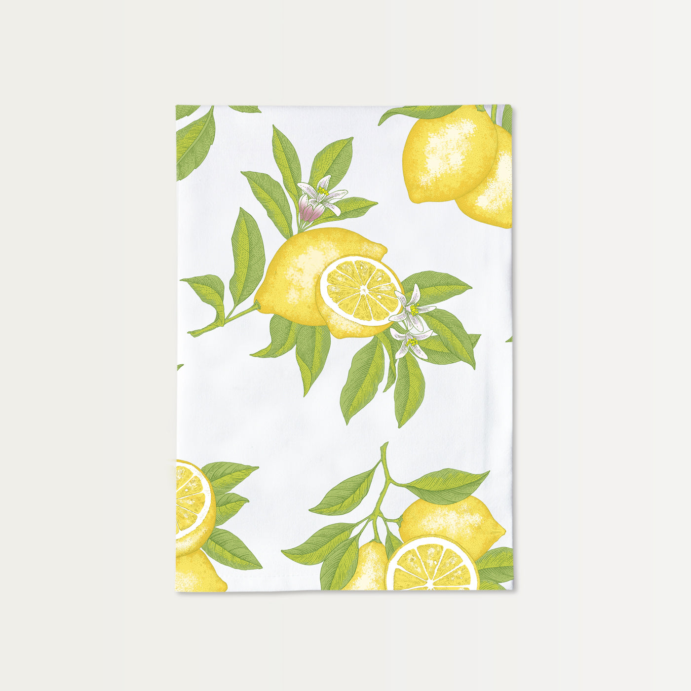
I started with lemons—a classic theme in any kitchen. It was no easy project. I did a lot of research and planning and set out to create the most beautiful lemon drawings I could possibly muster. My subject more specifically was Meyer lemons since they have gorgeous pink-hued blossoms and are popular in cooking and cocktail-making today. Each lemon ‘grouping’ was to be drawn separately on 17” tall paper. Then I would scan my drawings at high resolution and colored them digitally. I referenced hundreds of vintage and modern drawings of lemons, and even a few old-world paintings of lemons. It took a couple months because I had to test and learn, then start again. For example, early in the project a friend stopped in. She looked at my drawing and remarked, “Those look like Christmas balls.” It was a personally devastating comment (and an innocent one), but she was right. I started again. I worked slowly in ink on paper, stippling, cross hatching, and stippling again (stippling is simply making tiny dots to create shadow and dimension). I like to loosely mimic the line work that I’ve studied in old-world etchings. It gives my ink drawings an antique flair.

The highest bar: Better than everyone else
I should tell you that the goal when creating Brook Isle art or design is to achieve a result that is far better than anything in the world. Does that sound arrogant? Lofty? Maybe so. But it’s a worthy goal. With that high bar in mind, I was finally seeing something highly detailed and sophisticated emerging from all the trial and error. I combined the groups of finished lemons in a pleasing repeat layout, almost like a toile. I like to limit the colors to achieve an old-fashioned screen-print feeling that feels simple and not overengineered. Depending on the design, a simpler color treatment can feel pure and honest.
Lemons have long been considered a symbol of longevity, purification, love, and friendship. I hope you have these things in your life. If you own one of our Lemon Cotton Towels or Lemon Paper Placemat Sets, I’m confident that you will enjoy and admire its design for years to come.
Our background story for our lemon artwork design should tell you that it took great care and effort to make, but it was also a joyful process. I’d like to believe that a more careful and committed artwork process gives a lovely nod to the centuries before us. It’s time to slow down and make beautiful, quality things. Because we all deserve better.

